Hey there - my name is Hany, and this is my portfolio. Let's Work Together
I am currently based in Campinas, São Paulo, open to work and collaborations, with availability for relocation aligned with professional opportunities.
Feel free to reach out.
hanystocco@gmail.com
↗
55 (35) 998870960
↗
↗
Behance
↗
Hany Stocco,
Hany Stocco,
UX/UI Designer
Insights
From the data, three main needs emerged:
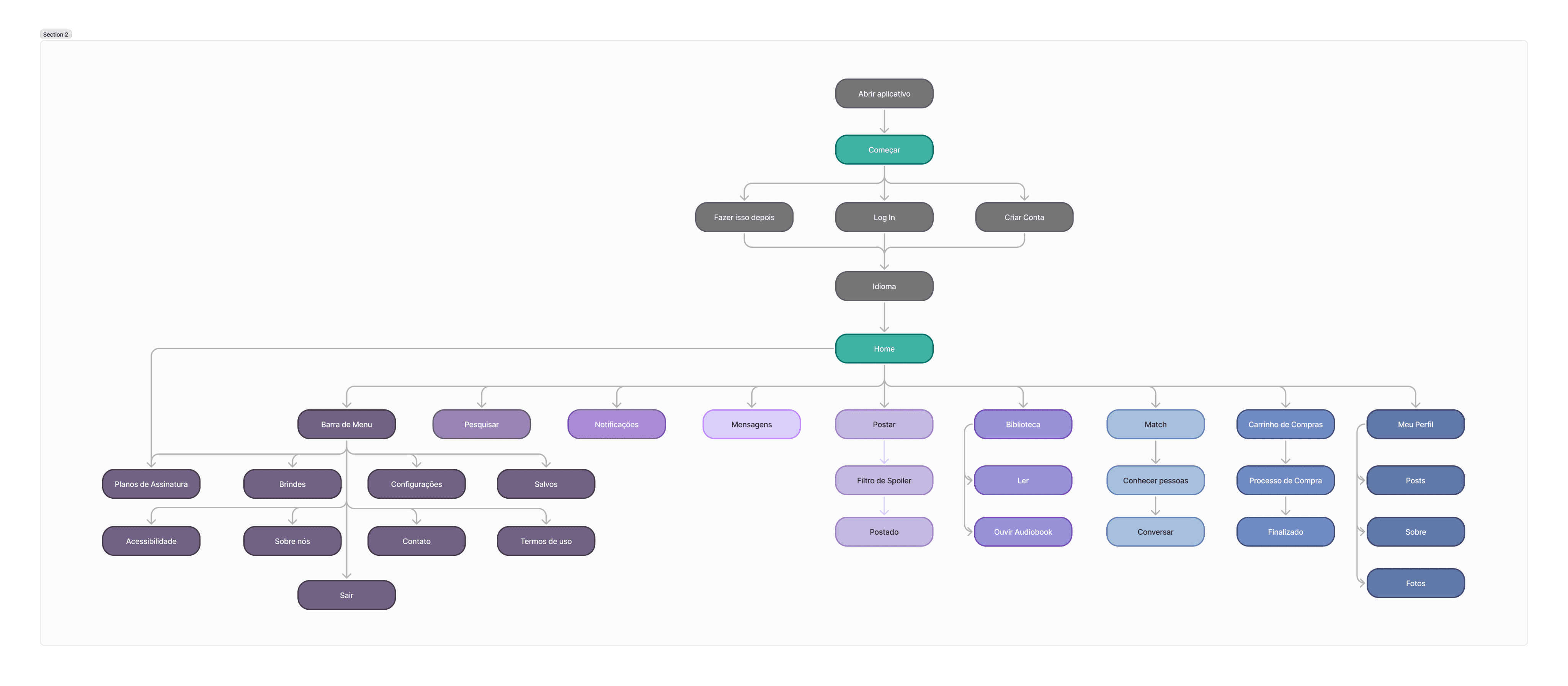
Flowchart
Complete mapping of the information architecture and app navigation.
User Journey
Access the app and create an account
Browse books, reviews, and community
Connect with other readers
Buy books or access exclusive content
Interact with posts and create your own reviews
Wireframes
Low and medium fidelity wireframes were created to validate flow, visual hierarchy, and essential points: onboarding, literary feed, reader profile, book screen, reviews, and purchase area.
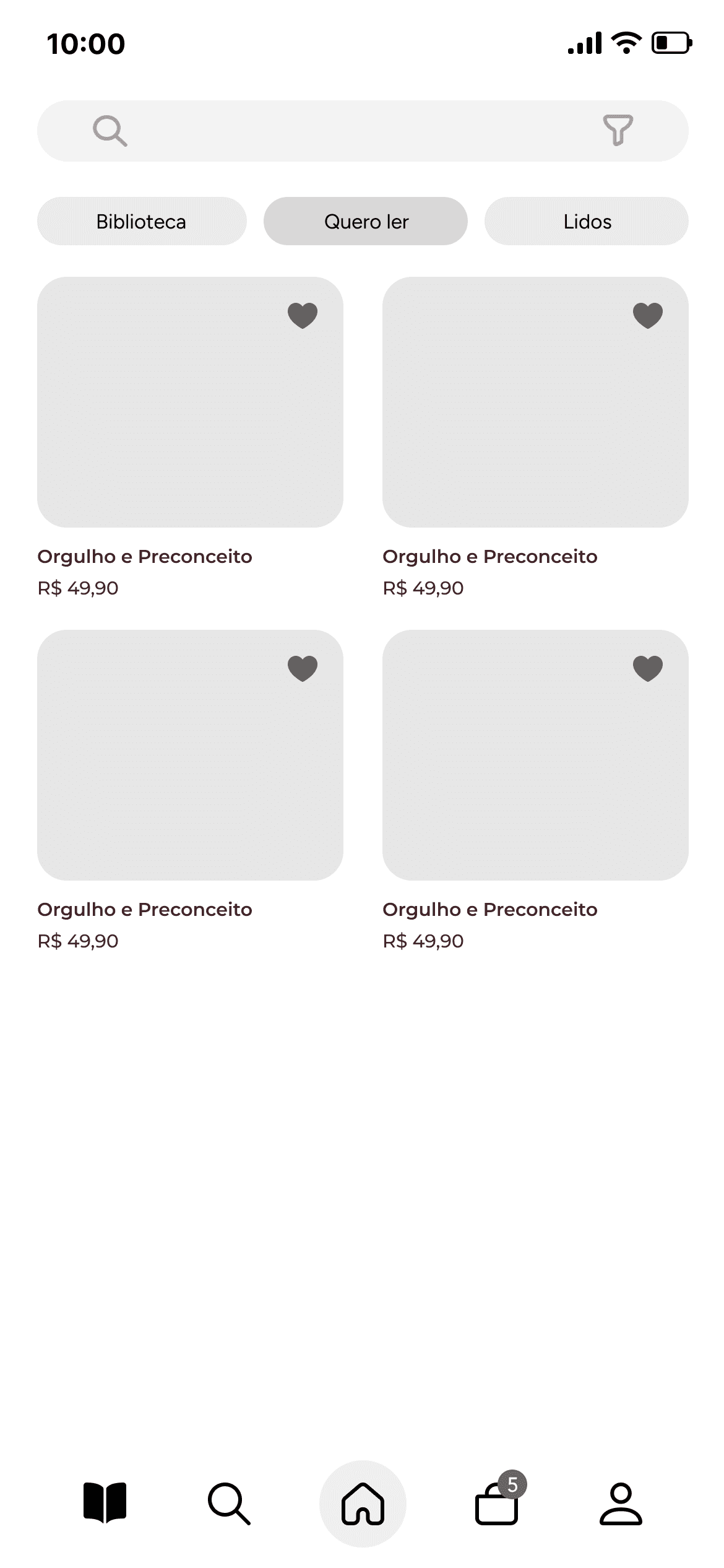
Final UI
Watch the prototype in action showing the complete user journey in the app:
RESULTS
What improved?
The reader experience became more fluid, centralizing multiple functions that were previously scattered across multiple apps.
The clear and inviting interface encouraged engagement and the creation of an active community.
The visual design reinforced the literary theme in a modern and accessible way.
What did I learn?
The importance of simple yet targeted research to validate real user needs.
How to integrate multiple functionalities into a cohesive and intuitive flow.
How to develop a strong visual identity aligned with the product's purpose.
How to unite community + marketplace + content within a user-centered app.
Centralize literary features in a single app.
Facilitate connections between readers, encouraging communities and discussions.
Offer support to independent authors, expanding visibility and access.
Centralize literary features in a single app.
Offer support to independent authors, expanding visibility and access.
Facilitate connections between readers, encouraging communities and discussions.
LIBBER OVERVIEW
Context
Libber is an app for readers that brings together, in one place, essential features for those who love reading: publish reviews, buy physical or digital books, meet new readers, publish independent works, and follow literary content. The name derives from the Latin "Liber," which means "Book," reinforcing the brand's core concept.
Challenge
When analyzing the market, we realized there is no Brazilian app that integrates multiple literary functions in a practical and accessible way. There's a lack of complete platforms, adapted to the national audience, that promote reading, socialization among readers, and access to works.
My Role
I worked on developing the visual identity, UX Research, user flow definition, wireframes, UI Design, and interaction prototyping. This project was developed in collaboration with a team.
PROBLEM
What needed to be solved?
Brazilian readers use several different apps for book-related activities — reviews, purchases, book clubs, social networks — creating dispersion, low adoption, and loss of engagement. A centralized platform that brought everything together was missing.
Who were the users?
▪Young adults who read regularly
▪People who buy books online (88.82%)
▪Readers who miss a virtual space to connect with others (72.94%)
▪Independent authors seeking accessible channels to publish their works
PROCESS
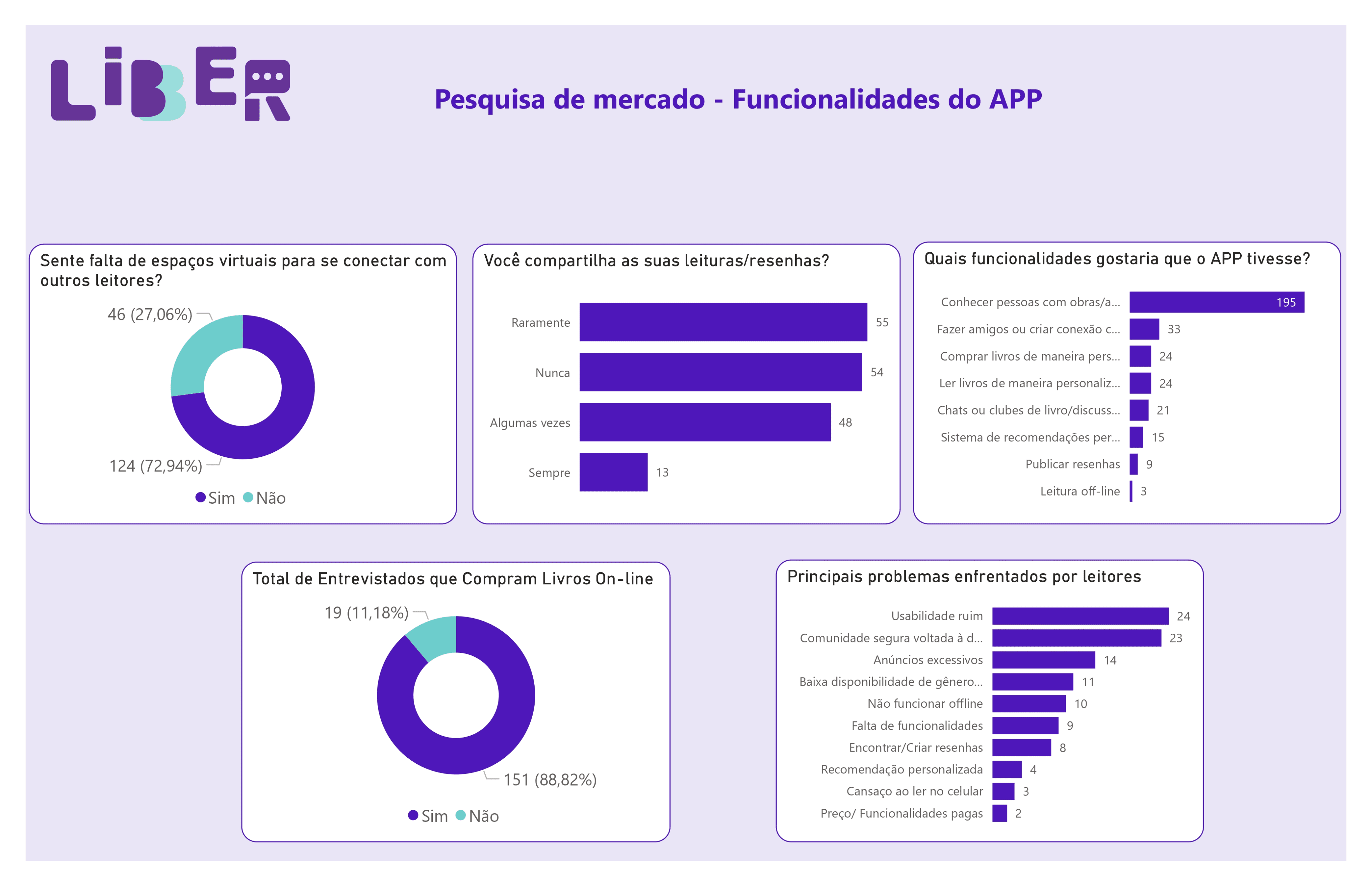
Research
During exploratory analysis and market research:
88.82% of respondents stated they buy books online.
72.94% reported missing a digital space to connect with other readers.
We noticed the absence of a complete national app that unites community + purchase + publication + reviews.
LIBBER OVERVIEW
Context
Libber is an app for readers that brings together, in one place, essential features for those who love reading: publish reviews, buy physical or digital books, meet new readers, publish independent works, and follow literary content. The name derives from the Latin "Liber," which means "Book," reinforcing the brand's core concept.
Challenge
When analyzing the market, we realized there is no Brazilian app that integrates multiple literary functions in a practical and accessible way. There's a lack of complete platforms, adapted to the national audience, that promote reading, socialization among readers, and access to works.
My Role
I worked on developing the visual identity, UX Research, user flow definition, wireframes, UI Design, and interaction prototyping. This project was developed in collaboration with a team.
PROBLEM
What needed to be solved?
Brazilian readers use several different apps for book-related activities — reviews, purchases, book clubs, social networks — creating dispersion, low adoption, and loss of engagement. A centralized platform that brought everything together was missing.
Who were the users?
▪Young adults who read regularly
▪People who buy books online (88.82%)
▪Readers who miss a virtual space to connect with others (72.94%)
▪Independent authors seeking accessible channels to publish their works
PROCESS
Research
During exploratory analysis and market research:
88.82% of respondents stated they buy books online.
72.94% reported missing a digital space to connect with other readers.
We noticed the absence of a complete national app that unites community + purchase + publication + reviews.
Insights
From the data, three main needs emerged:
Flowchart
Complete mapping of the information architecture and app navigation.
User Journey
Access the app and create an account;
Browse books, reviews, and community;
Connect with other readers;
Buy books or access exclusive content;
Interact with posts and create your own reviews
Wireframes
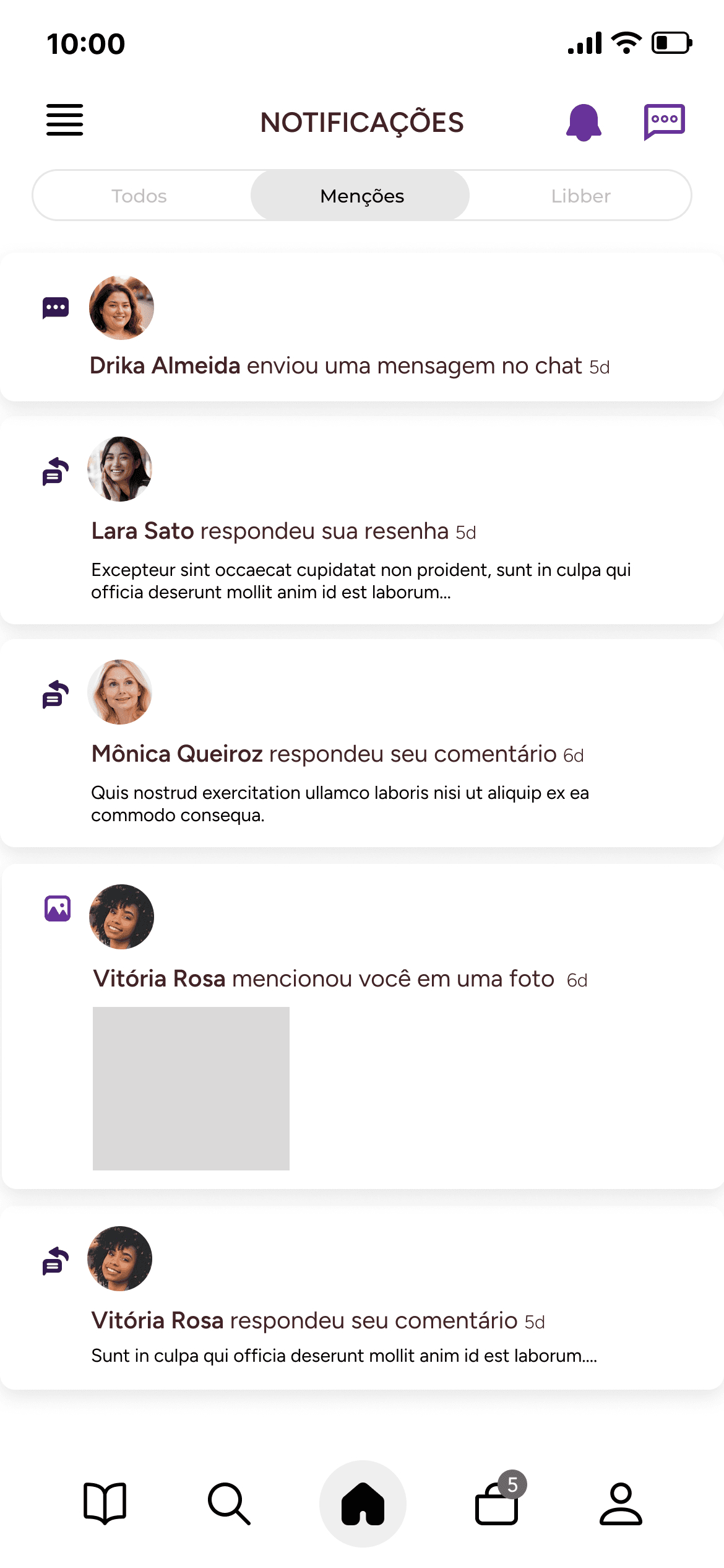
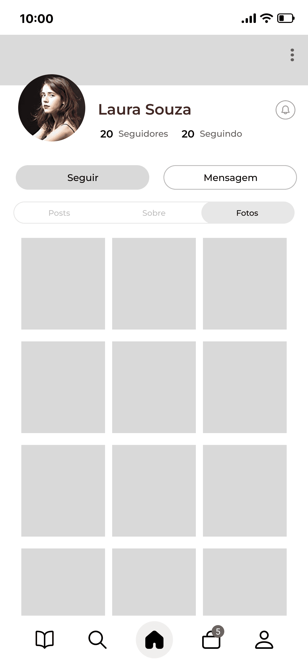
Low and medium fidelity wireframes were created to validate flow, visual hierarchy, and essential points: onboarding, literary feed, reader profile, book screen, reviews, and purchase area.
Final UI
Watch the prototype in action showing the complete user journey in the app:
RESULTS
What improved?
The reader experience became more fluid, centralizing multiple functions that were previously scattered across multiple apps.
The clear and inviting interface encouraged engagement and the creation of an active community.
The visual design reinforced the literary theme in a modern and accessible way.
What did I learn?
The importance of simple yet targeted research to validate real user needs.
How to integrate multiple functionalities into a cohesive and intuitive flow.
How to develop a strong visual identity aligned with the product's purpose.
How to unite community + marketplace + content within a user-centered app.